End of Line Testing
Facilitating real-time data
Overview
The End of Line Testing (EOL) application helps Precision Planting engineers to view quality assurance test data for their products.
The problem at hand
Often times hundreds or even thousands of tests may be ran over the course of a few weeks, making it difficult to parse through the data to see which units are passing and which are failing the tests.
Goals
Due to the data-first priority of the application, a few main objectives of the user interface emerged after careful user research with stakeholders:
- Make key actionable data easy to discover and analyze.
- Allow test results to be easily accessible without visually overwhelming users.
- Ensure data visualization matches the expectations of the core user group.
Planning & Prep
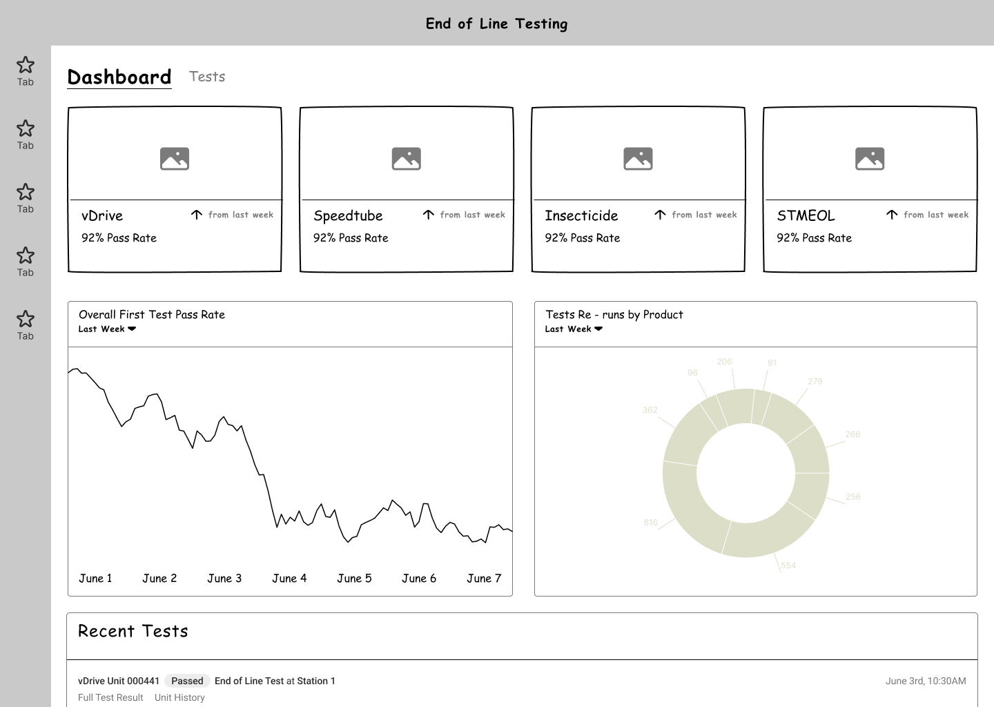
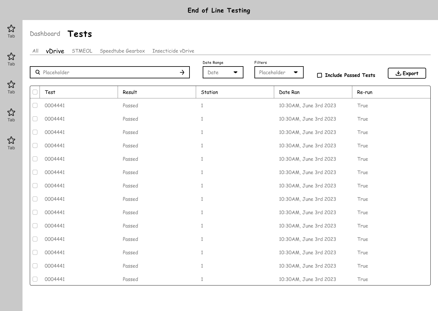
Before jumping into the design, I took some time to wireframe the overall layout of the main views of the application. I had in mind the navigation structure of the application and the priority elements users would want to see / access without taking too many additional actions.
Results, Vizualized
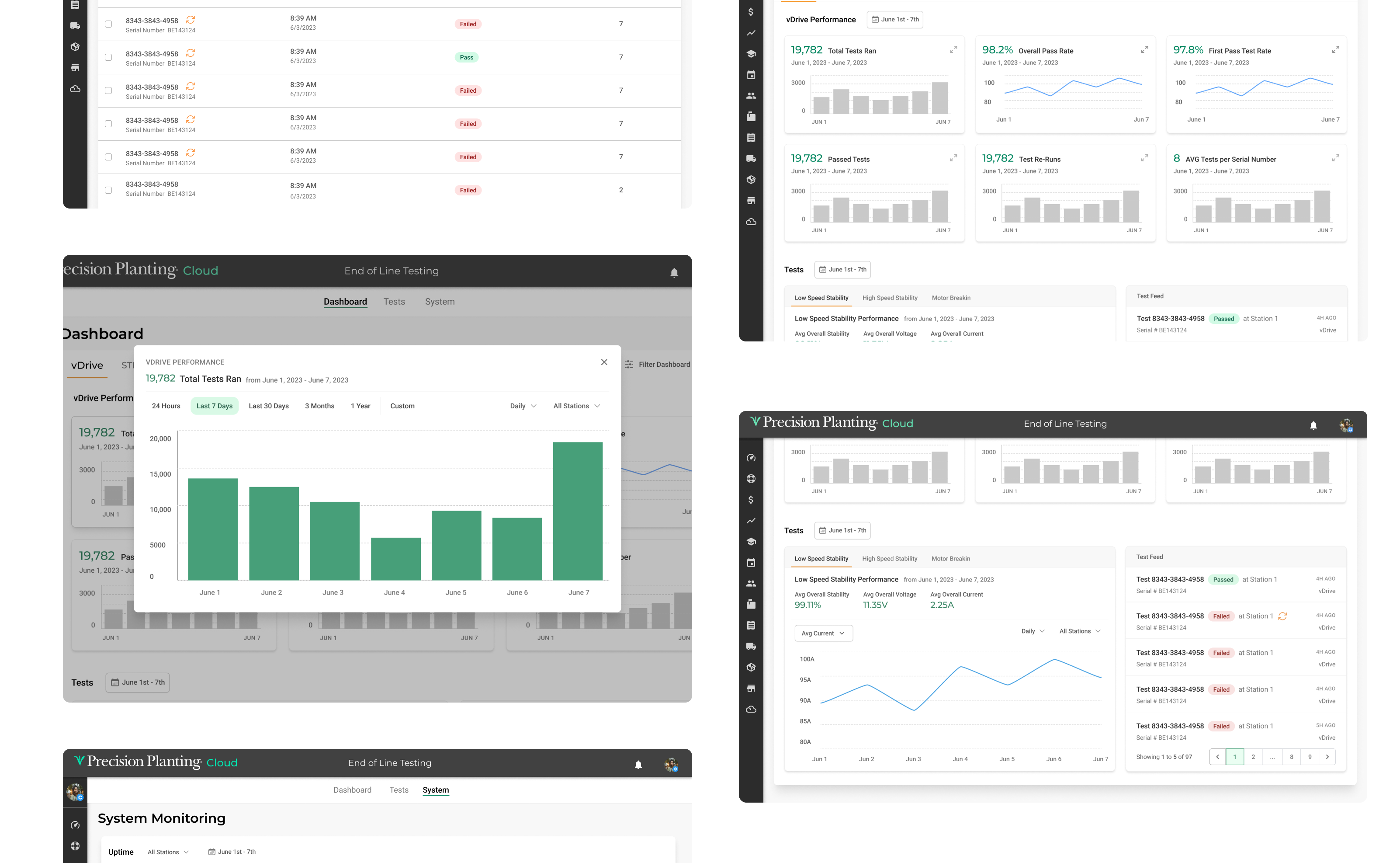
After working through wireframes, the main dashboard was designed. The design emphasized the display of six important data metrics as well as a dedicated summary panel and live test feed.
Expanded Views
Users can click on the initial data cards for an expanded view of the metrics. In this view, the data can be further refined, making it easy for users to customize their approach to data visualization.
Listing it Out
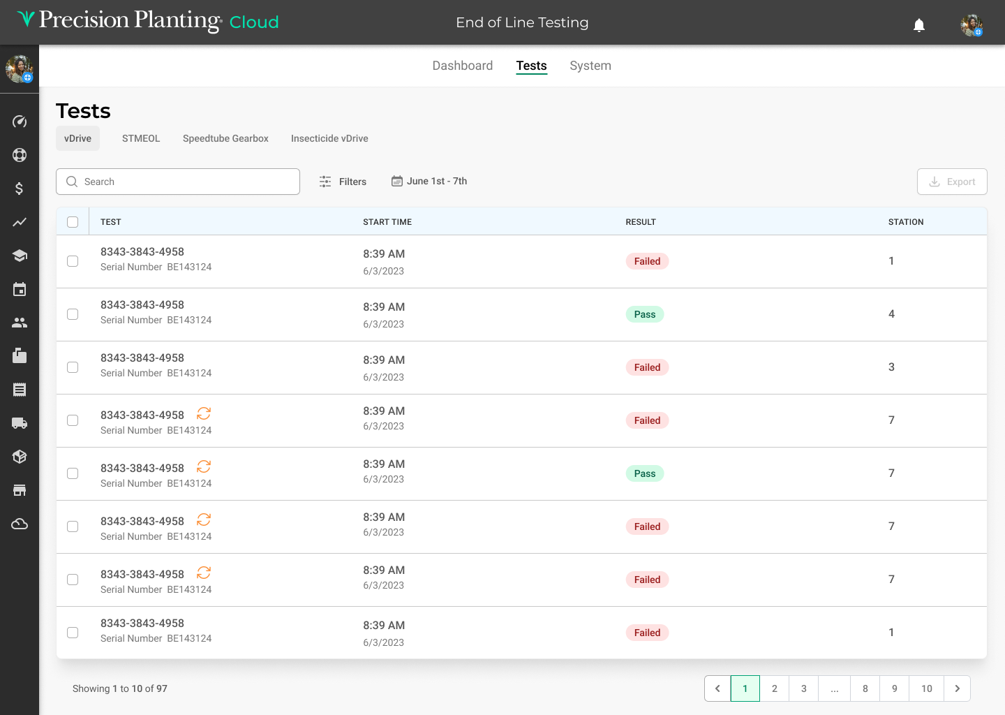
A table view was selected as the best way for users to sort through the numerous test results. Due to the large amount of test results, extensive filtering options were added to streamline the ability for users to navigate to their desired test result entry.
It's All in the Details
Users can click on each test entry to view the data collected during the EOL test. In this section, users can also compare the selected test result to the averages of other results, allowing users an immediately helpful use case when needing to evaluate results at a glance.
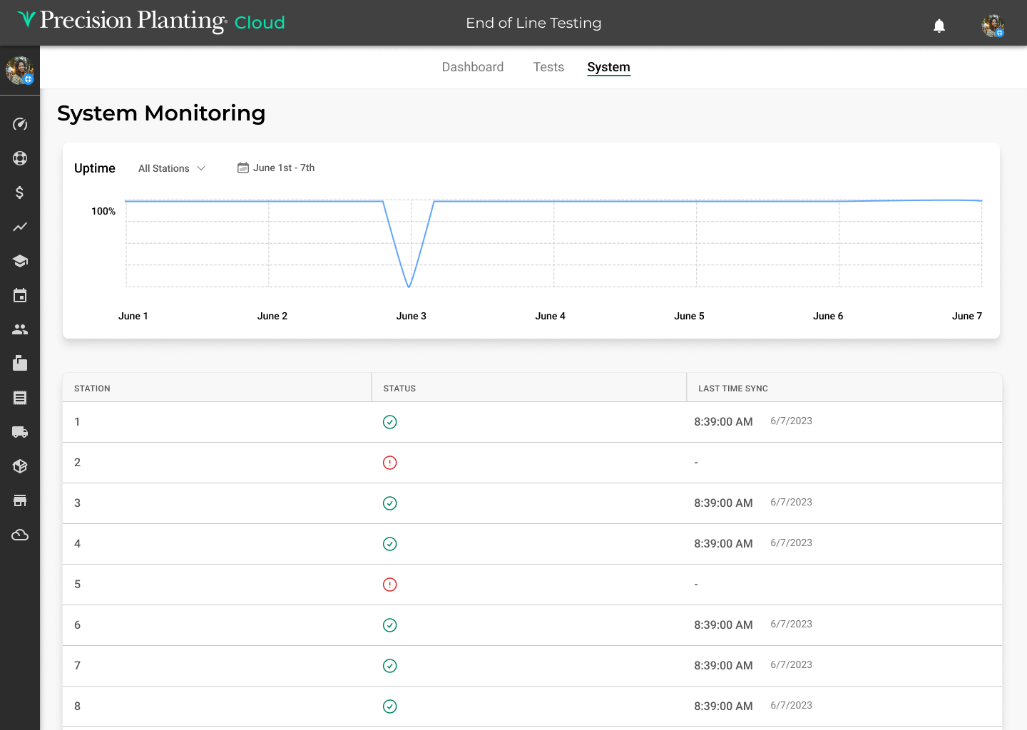
Monitoring Uptime
Lastly, a system monitoring section was created in order for users to track the uptime/downtime of the physical units that run the EOL tests and transmit the data for use in this cloud application.
Takeaways
In reflecting on the process of designing the EOL dashboard application one takeaway rises to the surface above others: the importance of frequent communication with stakeholders and users. While this case study shows the visual designs and general UX results, what is not shown is the countless hours of essential conversations on what data should be displayed, how the design aesthetic should contribute to the overall experience etc. I finished this project having acquired a firm grasp on the vital necessity of including users in all aspects of the design process - not just showing them finished designs.